CLIENT
Presafe
MY ROLE & TEAM
Design Lead
Team of 5 consisting: UX Researcher, PM, Designer, & Engineer.
OPPORTUNITY
UI/UX. Onboarding Experience.
As lead designer for Presafe, a healthcare app, I leveraged usability testing beyond the client's onboarding task, streamlining core flows and enhancing accessibility to transform the UX. My proactive approach delivered tested triumphs, validating my vision for an intuitive, inclusive product experience.
RESULTS
3 participants completed usability testing with 0 misclicks.
Our new core designs increase usability by 32%.
Users enjoyed the animations and content of the onboarding experience.
BUSINESS GOALS
Presafe is a healthcare platform supporting 6.5M+ Americans with dementia and their caregivers. While aiming to enhance safety and independence, usability challenges hindered its effectiveness:
High Drop-Off Rates:
Complex workflows led users to abandon onboarding.
Underutilized Features:
Critical safety monitoring tools were not being accessed effectively.
Accessibility Gaps:
Limited support for elderly users reduced platform inclusivity.
Navigation Inefficiency:
Poor task completion rates frustrated both caregivers and recipients.

OUR CHALLENGE
The launch of Presafe's beta app struggled due to a lengthy registration process and lack of user education, leading to high abandonment rates among busy users. Resolving these issues is critical for Presafe’s success.

OUR SOLUTION
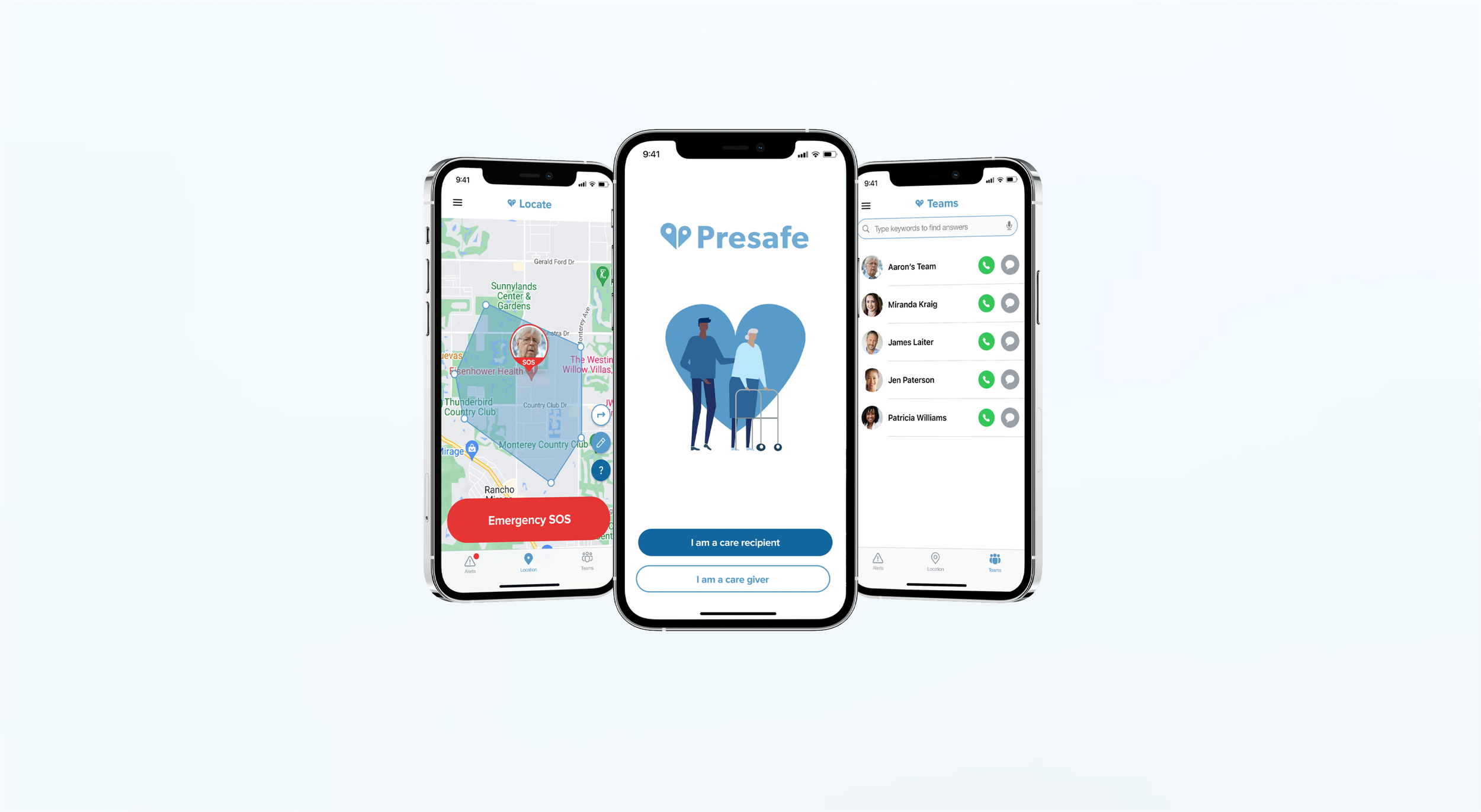
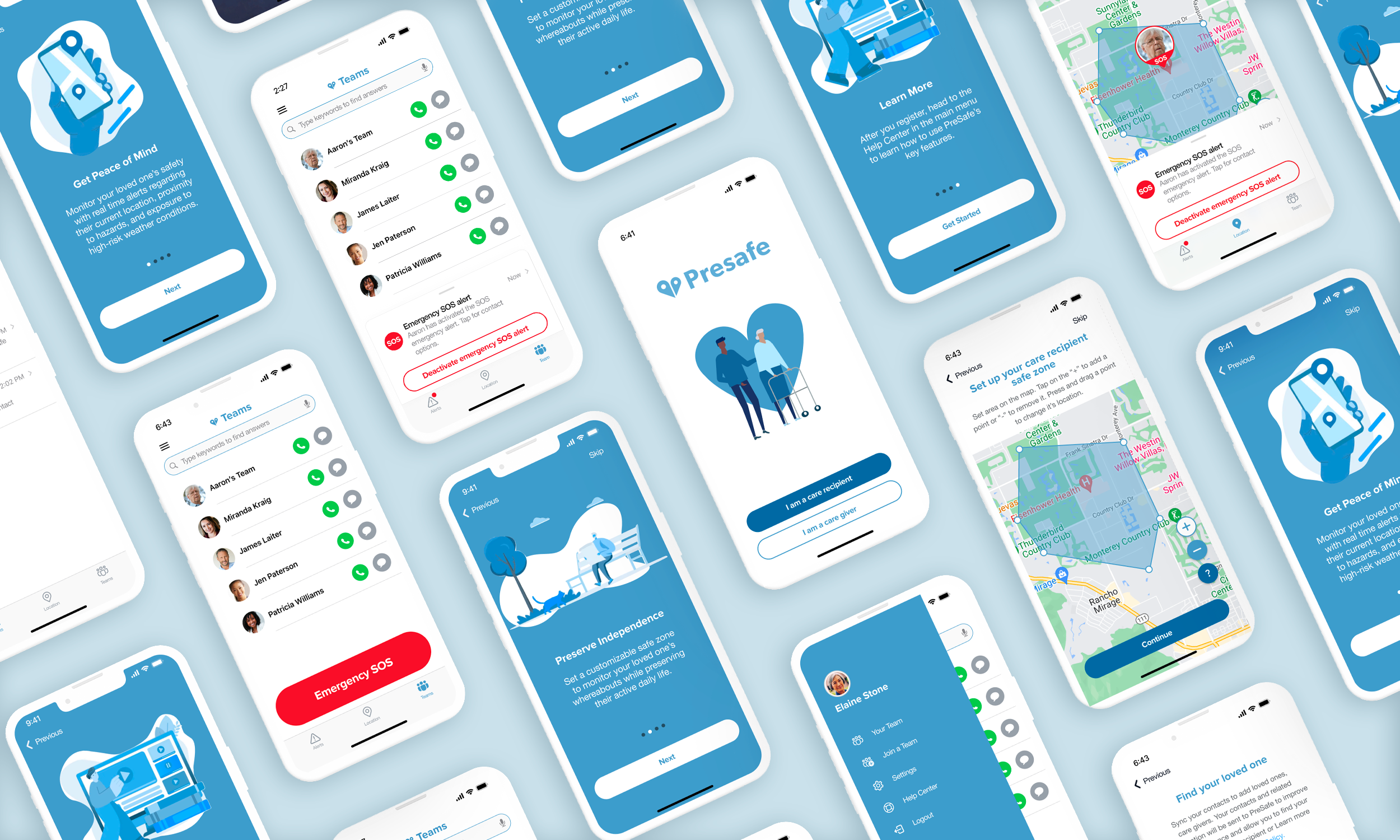
We designed an onboarding experience that emphasizes the benefits of using the Presafe app, redefined 4 core flows, and developed a Help Center based on user insights and research to improve usability and accessibility.
UNDERSTANDING OUR USER
We conducted an 11-person user survey and secondary research. Through this process, we discovered that caregivers’ primary needs, such as security, support, and time, were well-aligned with Presafe's features. These insights were instrumental in shaping our target user.
ONBOARDING FLOW
Removed unnecessary form fields to reduce user effort.
Streamlined the flow by showing only relevant fields based on user role.
Made certain input fields optional to further simplify the process.
Reduced the total number of screens, resulting in a faster onboarding experience.
After
Before
DESIGN ITERATION 1
Before & After below show the first round of design changes we made based on research, usability testing and user survey analysis.
After the first iteration, it became apparent that having messaging as a standalone tab increased development complexity and cluttered the user interface.
Solution (seen in Final Solution GIFs below) Offloaded messaging functionality to other features, simplifying the interface and reducing unnecessary complexity.
FINAL DESIGN
To improve clarity for our users, we iterated the app based on feedback from usability testing and Nielson’s heuristic evaluation. This process included:
two app versions: care giver & care recipient
updating its information architecture
creating real-time alerts
implementing new style guide that meets WCAG standards
develop clear navigation through iconography
used familiar language
Care Giver - Onboarding Experience
Care Recipient - Set Safe Zone
Care Recipient - Activate Alert
Care Giver - Deactivate Alert
NEXT STEPS
Onboarding Flow with Tooltips
1
Incorporate tooltips and a step-by-step guide that walks the user through the app's features and functionalities.
Personalized Reminders and Recommendations
2
Include a feature that allows caregivers to set reminders and notifications for appointments, medication, meal times, and other important tasks.
Apple Watch App for Health and Activity Monitoring
3
Develop an Apple Watch app that can track the care recipient's daily activity levels, heart rate, sleep patterns, and other wellness indicators.
“Thank you Tatiana, it looks outstanding. The high quality is what you get from someone with a BFA from Parsons and years of product design work.”
— GREG ELOFSON, PRESAFE CEO


